
REFLECTION
Q: Who is a mixed media artist that stands out to you and why?
A: Through my research,I consistently found Shannon Finley's work to be very appealing. Geometric patterns immediately attract my eye,as do vibrant colors,and he uses both in many of his works. Visit this site to see more of his work: https://www.artsy.net/artist/shannon-finley. His use of digital media, along with his use of a variety of hues, helps to create final works that push the boundaries of painting. He is able to create optical depth in his works that is not often seen in two-dimensional paintings with the help of the computer as well. His new show (as of 2014), is the artist's first solo exhibition in New York. It showcases thirteen vibrant acrylic-and-gel pieces, which are all abstract. I find his use of symmetry and linear designs to be very visually aesthetically appealing. A few examples are these: https://www.artsy.net/artwork/shannon-finley-looper and https://www.artsy.net/artwork/shannon-finley-rhombus-amplified. I particularly like how he chose to not make the colors symmetrical though, as he fades in a more gradient manner from one color to the next throughout some of his works. I don't find his more "dull" colored works to be as appealing, but that's just personal opinion. His work impresses me overall, by the way he "creates" space where one would assume it to be a 2D space. In one interview he was asked this, "Do you maintain computer blueprints for your final pieces? I think it'd be cool to see the "befores" and "afters" of your work." and responded, "There’s no before and after for the paintings; the computer drawings grow together with the paintings, layer by layer. The digital is completely intertwined with the handmade, and both feed off of and inform the other." Click here to learn more about his work: http://www.artinamericamagazine.com/reviews/shannon-finley/
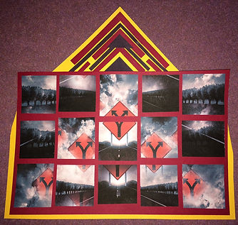
For this piece, which was part one of working with mixed media in class, I chose to base it off a dream I had recently about being lost in a maze and not knowing where I was going. I translated this dream to reality to appear like a road with a sign at the end that pointed different directions. I wanted to convey a dream type of picture, but convey the same message and feeling of being lost. In my dream, the way I got out of the maze was by looking up and seeing the bright sky amidst the darkness around me. When looking for an image to use , I came upon the perfect picture of a straight road with a sign at the end. In photoshop, I was able to copy parts of the photo to create a "blurred vision/ double time" effect. I also changed the coloring to make the image appear darker and have a reddish tint, because red signifies danger, and that's how I felt in the dream like there was danger all around me. After creating an image I was happy with, I printed it out and used previous scrapbooking experience to cut the image into pieces and rearrange them so that the 5 arrows together created one big arrow, as if telling the viewer (or dreamer) to look up and have faith that it will all be okay.
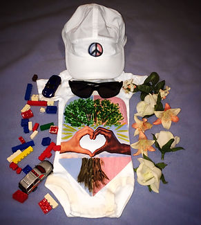
For part 2 of this mixed media assignment, I decided to navigate my way through
getting a social message across in the most painless way I could think of. I used one of
my own baby onesies (dug it out from a box in the basement) and boy/ girl decorations/
toys on the "appropriate" sides, separated by the pink and blue colors which traditionally
represent male and female. I digitally made the pink and blue background and the
hands forming a heart, as well as the peace sign (I edited out a Nike symbol that was on
the hat). I printed the image off on ironing paper and ironed it onto the onesie. Then I
finger painted the tree to incorporate another medium and to show a child's type of work
on their own clothing. I wanted the tree to symbolize equality and growth, because it is
the background for the hands forming the heart, but symmetrical for the most part on
the onesie. I included the sunglasses to show that today's society is moving toward
being more blink to the separation on gender and race. The white hat is gender neutral,
and the peace sign is half blue and half pink, yet united with another neutral color
(black) to show that we are all equal. There should be peace and love no matter what
you look like or where you came from, because we all started as babies, innocent to all
the hatred and stereotypes in the world because of race and gender. I believe that
children today will grow up more "free" than ever before free to express themselves
and be who they want to be.
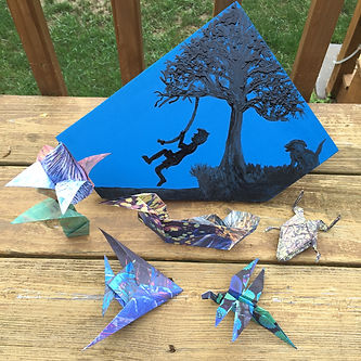
For part three of the assignment, I was inspired by my camp. The week I made this, my mom and I were going through old arts and craft stuff. I found lots of origami that I made when I was a kid, and thought, hey, that’s 3D art and I could do something with this! I looked up origami figures and decided to make my project a camp-themed work. I decided that 5 figures was a good number so I looked up origami patterns for common things I see at camp, like flowers, frogs, dragonflies, ducks, and fish. I needed to incorporate digital art so for each of the 5 objects I chose, I created my own image to print on paper, instead of plain or already patterned paper. For example, the three pictures I used to make the duck image were lilypads, water, and a feather. I blended the images and altered the blended picture a bit on photoshop. Once I made the images, I printed them double sided and cut them out into a square to start origami. Once all origami figures were made, I decided I needed a backdrop for these pieces, and I wanted to reiterate the camp theme, so by painting on a piece of wood and going over it with ink, I think I was able to create a piece that is tied together, 3D, and unique.